The psychology behind book covers taps into the human brain’s immediate responses to visual stimuli, impacting readers’ decisions almost subconsciously. When confronted with a myriad of options, a potential reader might only spare a few seconds contemplating a particular book. During this brief window, the design of the book cover acts as a first impression, conveying the book’s essence and genre without requiring a single word from the reader.
Several factors play into the overall book cover impact. Visual hierarchy, for instance, helps in guiding the reader’s eye across the cover, highlighting the most important elements first. A well-structured hierarchy can lead to a more engaging and memorable cover. Besides, specific design elements can evoke emotions that align with the book’s content. For instance, a thriller might use darker themes and more intense imagery to elicit a feeling of suspense or unease.
Moreover, subtle psychological triggers like familiarity and novelty work hand in hand. While readers might be drawn to covers that align with what they already know or like, a unique design that stands out can also capture their attention. As Malcolm Gladwell famously stated, “We are innately suspicious of things that do not fit our expectations.” This suspicion is what a well-designed cover can leverage, subtly coaxing a potential reader’s curiosity.
In addition, cultural and social factors play a significant role, as different colors, imagery, and typographies can have various connotations across cultures. A design that resonates well in one region might have an entirely different reception in another.
Understanding these psychological principles helps designers craft covers that not only attract but also communicate effectively, ensuring a deep and lasting connection with the audience right from the first glance. This profound connection, initiated through the cover, often determines whether a reader will invest the time to explore the words within.
Elements of effective cover design
Designing an effective book cover involves balancing numerous elements to create a striking and cohesive visual that resonates with the target audience. Among these elements, imagery, typography, color schemes, and layout stand out as fundamental components that can significantly influence the book cover impact.
Imagery is often the centerpiece of a book cover, serving as a visual teaser for the book’s content. A well-chosen image can evoke emotions, set the tone, and provide context about the story. High-quality visuals that are relevant and engaging are crucial. For instance, a novel set in a dystopian future may feature stark, haunting landscapes, whereas a light-hearted romance might showcase vibrant, joyful scenes. Effective imagery isn’t necessarily complex; sometimes, a minimalist approach can leave a stronger impression.
Meanwhile, the type of images used needs to tie cohesively with the book’s genre and intended audience. Illustrations versus photographs, for example, can convey very different messages. Illustrative covers generally evoke a sense of whimsy or artistic flair, often used in genres like fantasy or children’s books. Photographic covers might be employed for non-fiction or contemporary fiction to lend a sense of realism and immediacy.
The layout or composition of these elements is equally vital. A well-structured layout guides the reader’s eye through a visual journey, ensuring that the most critical information, such as the title and author’s name, is noticed first. Employing techniques like the rule of thirds or golden ratio can result in a balanced and aesthetically pleasing design. Alignments and margins also contribute to the professional look of the cover, ensuring that elements don’t appear cluttered or haphazardly placed.
Special effects and embellishments can add another layer of intrigue to the design. Techniques such as embossing, foil stamping, or textured coatings can give a cover a tactile quality that distinguishes it from others. These effects invite readers to pick up the book, increasing the likelihood of purchase through physical interaction.
Balancing all these elements requires an understanding of both artistic principles and marketing strategies. The ultimate goal is to create a cover that not only draws the eye but also communicates the book’s core message in an instant. Such a cover becomes a potent marketing tool, a visual ambassador that can make or break a potential reader’s decision to delve into the story.
“Good design is obvious. Great design is transparent.” – Joe Sparano
The role of color schemes

Color schemes play a pivotal role in the book cover impact, with specific hues and combinations working to evoke certain emotions and responses from potential readers. Colors can set the mood of the book before a single page is turned. For instance, blues and greens might be used to convey tranquility or seriousness, while reds and oranges can signify excitement, danger, or warmth.
Designers use color to create contrast and draw attention to key elements of the cover. High contrast schemes can highlight the title or author’s name, making it easy to read from a distance or when browsing online thumbnails. On the other hand, low contrast schemes might be more appropriate for genre-specific nuances or a more sophisticated aesthetic.
Understanding the theory behind colors and their psychological impacts is crucial for creating effective book covers. Warm colors like red, orange, and yellow are often associated with energy, passion, and positivity, making them perfect for action-packed or inspirational books. Conversely, cool colors such as blue, green, and purple can induce feelings of calm, professionalism, or mystery, ideal for self-help, technical manuals, or fantasy genres.
Additionally, colors carry cultural and contextual meanings that vary globally. In the Western context, white usually represents purity and simplicity, making it a popular choice for minimalist designs or wedding-related topics. Black, often linked with sophistication or elegance, might be used for literary fiction or high-end market books. However, the same colors might have different connotations in other cultures, which is critical to consider if the book is intended for a global audience.
Complementary and analogous color schemes also play a part in forming an aesthetically pleasing design. Complementary colors, positioned opposite on the color wheel, create a vibrant look and can make details pop, whereas analogous colors, which sit next to each other on the color wheel, offer a more harmonious and relaxing feeling. Both strategies are used to evoke specific responses and align with the book’s content.
For instance, a thriller novel might use stark, contrasting colors like black and red to grab attention and suggest danger, whereas a romance novel might use soft, pastel colors like pink and lavender to evoke feelings of warmth and tenderness. Science fiction covers may utilize metallic hues like silver and blue, hinting at futuristic themes, while historical fiction might opt for sepia tones to evoke a sense of antiquity.
Lastly, experimenting with color gradients and transitions can add depth and complexity to a cover. Gradients can create a sense of movement or light, enriching the visual experience for potential readers. These effects can be subtle or pronounced, depending on the intended impact.
The strategic use of color in book cover design is far from arbitrary. By carefully selecting and combining colors, designers can create compelling covers that evoke the right emotions and align with both the book’s content and the audience’s expectations. The right color scheme can be the difference between a book that blends into the background and one that stands out on the shelf, ultimately enhancing the book cover impact and compelling readers to take a closer look.
Typography and its influence
Typography holds a powerful sway in the realm of book cover design, acting not just as a medium for conveying the title and author’s name but also influencing the book cover impact through its style, size, and placement. The strategic selection of typefaces and their application can significantly affect a potential reader’s perception and decision-making process.
Choosing the right typeface is crucial, as it sets the tone for the book’s content. Serif fonts, with their classic and formal appearance, are often chosen for historical fiction or literary works, exuding a sense of tradition and trustworthiness. Conversely, sans-serif fonts, known for their clean and modern aesthetic, are typically used for contemporary or non-fiction genres, infusing a sense of clarity and straightforwardness.
The hierarchy of typography on a cover also guides the reader’s eye, emphasizing the most important elements. This might involve using larger, bolder fonts for the title and subtler, smaller fonts for the author’s name or additional details. For instance, a thriller might have a bold, imposing typeface for the title to convey intensity and urgency, while a fantasy novel might use an ornate, decorative font to evoke a sense of whimsy and mystery.
The placement of the text plays a pivotal role in the overall layout. Designers often utilize the rule of thirds, aligning text along imaginary lines to create a balanced and engaging composition. Effective spacing between letters (kerning) and lines (leading) ensures that the text is readable and aesthetically pleasing. An overcrowded or poorly spaced design can overwhelm the reader, detracting from the cover’s appeal.
Layers of text hierarchy can be strategically used to highlight endorsements, series names, or subtitles, enhancing the book cover impact by providing additional information without cluttering the design. These auxiliary texts often use contrasting styles or colors to remain noticeable yet harmonious with the primary title and author text.
Special techniques like hand-lettering or custom typography can make a book cover unique, adding a personal touch that mass-produced fonts might lack. Hand-lettered titles can impart a sense of authenticity and individuality, making the book stand out in a crowded market.
Moreover, the interplay between typography and imagery is crucial. The text should not just exist alongside the artwork but should complement it, creating a cohesive visual narrative. This might involve integrating text into the image through creative layering or utilizing transparent text to blend seamlessly with background hues.
Below is an example of how different typefaces can change the perception of a book:
| Book Genre | Sample Typeface | Impact |
| Historical Fiction | Times New Roman | Classic, Reliable |
| Science Fiction | Futura | Modern, Futuristic |
| Romance | Scriptina | Elegant, Romantic |
| Thriller | Impact | Bold, Intense |
The choice of colors for typography also matters greatly. High-contrast colors ensure readability and catch the viewer’s eye, especially in a thumbnail view. For instance, white text on a dark background often provides a stark and eye-catching contrast, ideal for digital browsing.
In conclusion, typography is not merely a functional element but a critical design component that drives the book cover impact. It tells its own story through style and placement, enticing readers and conveying subtle cues about the book’s genre and tone. Whether through bold statements or elegant whispers, typography shapes the first impression and invites readers into the world within the pages.
Trends in modern book covers
 Today’s book cover designs are vibrant playgrounds where designers not only showcase their artistic prowess but also push the boundaries of traditional aesthetics. One noticeable trend is the shift toward minimalist designs. Simple, clean covers with sparse text and subtle imagery often stand out amidst a cluttered marketplace. This style draws readers in by letting their curiosity fill in the blanks, much like a teaser rather than a full reveal. The sparse approach arguably makes the ultimate book cover impact by pulling readers closer to investigate its mysteries.
In contrast, maximalist designs have also made a resurgence. These covers overflow with intricate details, lively illustrations, and bold typography. They aim to capture the book’s essence through an explosion of design elements that tell a visual story, enticing readers who appreciate complexity and detail. Maximalist covers often appeal to particular genres like fantasy or science fiction, where elaborate storytelling is mirrored by an equally rich visual aesthetic.
Another compelling trend is the use of hand-drawn or illustrated covers. These designs offer a personal, unique touch that mass-produced covers lack, creating a sense of individuality and craftsmanship. This trend is particularly popular in genres like children’s literature, indie fiction, and even cookbooks, where a handcrafted look can differentiate the book from others on the shelf.
Photography, too, holds its place but with a twist. Designers now lean toward evocative, high-contrast images with artistic filters and overlays, creating visual drama and immediacy. Photographic book covers are often used for memoirs, biographies, or contemporary fiction where a sense of realism needs to be conveyed. Advanced photo-editing techniques have enabled designers to create surreal, dream-like images that captivate and intrigue, making a substantial book cover impact.
Experimentation with typography is also on the rise. Custom, hand-lettered fonts lend a sense of authenticity and personality to book covers, perfectly balanced to complement the imagery and overall design. The interplay between bold, dramatic fonts and delicate, hand-written scripts often adds depth and texture to the cover, a visual experience that can be both powerful and nuanced.
Interactive and augmented reality (AR) book covers represent an exciting technological advance. By using AR, a static book cover can come alive with animations, providing an interactive experience that goes beyond the physical book. This trend is still in its nascent stages but promises to revolutionize how readers engage with books.
Moreover, environmental consciousness is influencing book cover designs. The use of sustainable materials, recycled paper, and eco-friendly inks speaks to a growing audience’s values. These covers often have a natural, earthy aesthetic, aligning the book’s external design with the principles it may advocate within its pages.
Finally, genre-blending covers are becoming popular, reflecting the increasingly hybrid nature of contemporary literature. These covers defy categorization, using design elements across genres to attract a broader audience. For instance, a dystopian romance might combine dark, edgy visuals with softer, romantic typography. This hybrid design approach can make a significant book cover impact by appealing to diverse reader groups.
These design innovations are not just about aesthetics; they are strategic moves to capture the reader’s imagination and market share. Trends in book cover design reflect broader cultural, technological, and economic shifts, creating a dynamic landscape where artistry meets marketing. As these trends evolve, they continually redefine the standards and expectations of what a book cover can and should be, ensuring that readers are always met with fresh, engaging, and thought-provoking designs.
Encouraging reflection, these trends prompt readers and designers alike to think deeply about what makes a book cover not just a protective shell but an integral part of the reading experience itself. With an ever-evolving array of styles and technologies at their disposal, designers continue to inspire a thirst for understanding and appreciation, driving the next wave of innovation in book cover design.
Case studies of successful designs
Examining successful book cover designs offers key insights into the elements that make a cover compelling and effective. These case studies demonstrate how various design principles, when executed well, can have a profound book cover impact.
Consider the cover of “The Girl with the Dragon Tattoo” by Stieg Larsson. The original design features a stark, minimalist approach, with a bold, yellow background and black, distressed typography. The simplicity of this cover draws the reader’s eye immediately to the title, while the use of yellow evokes a sense of intrigue and mystery. The dragon tattoo imagery is subtle yet powerful, hinting at the main character’s strength and complexity. This design effectively sets the tone for the novel, making it memorable and instantly recognizable.
In contrast, the cover for J.K. Rowling’s “Harry Potter” series utilizes a more maximalist approach. The intricate and colorful illustrations by artist Mary GrandPré provide a whimsical and magical feel that perfectly encapsulates the essence of the series. Each cover is filled with details that hint at the story within, from depictions of key scenes to symbolic elements. This rich, illustrative style appeals to both younger audiences and adult fans, making it a timeless and beloved design.
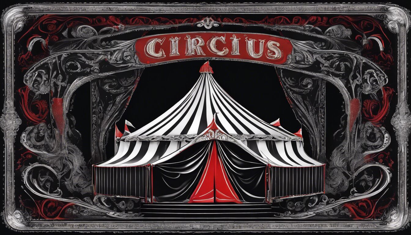
Another compelling example is “The Night Circus” by Erin Morgenstern. The cover design by Rodrigo Corral uses a black, white, and red color palette to create a sense of drama and elegance. The minimalistic yet striking illustration of a circus tent, combined with ornate typography, evokes the book’s magical and mysterious atmosphere. The cover’s contrasting colors and balanced composition make it stand out on bookshelves, inviting readers to explore the story within.
Then there’s the cover for “Becoming” by Michelle Obama, designed by Christopher Brand. This cover uses a high-quality photograph of the author, showcasing her friendly and approachable demeanor. The clean, sans-serif typeface is modern and confident, reflecting the book’s inspirational and personal nature. The overall design is simple yet powerful, conveying authenticity and warmth, which aligns perfectly with the memoir’s tone.
The design for “Big Magic” by Elizabeth Gilbert, crafted by Rodrigo Corral, employs a vibrant color gradient that transitions smoothly from pink to blue. The whimsical typography seems to float on the colorful background, mirroring the book’s theme of creativity and inspiration. The vibrant and playful design appeals to creatives and stands out on both digital platforms and physical shelves, making it an effective marketing tool.
Consider also the cover of “Pachinko” by Min Jin Lee, designed by Steve Kim. The design features a traditional Korean painting style, reflecting the book’s cultural heritage and historical narrative. The use of muted colors and intricate patterns conveys a sense of depth and tradition, inviting readers into the multi-generational story. The typeface is elegant and understated, allowing the artwork to take center stage. This thoughtful design enhances the book cover impact by aligning visually with the story’s themes and setting.
Finally, the cover of “Where the Crawdads Sing” by Delia Owens, designed by Debra Morton Hoyt, showcases a serene natural landscape with a warm, earthy color palette. The imagery of the marshes directly relates to the book’s setting, while the soft, flowing typography complements the peaceful scene. This cover effectively evokes the tone of the novel and attracts readers who are drawn to nature and poignant narratives.
These successful designs highlight the importance of harmonizing visual elements with the book’s content and target audience. Whether through minimalism, rich illustrations, or evocative photography, each cover makes a distinct and memorable book cover impact. These examples demonstrate that a well-designed cover not only attracts attention but also communicates the essence of the book, compelling readers to pick it up and dive into the story. By analyzing these successful designs, new and aspiring designers can gain valuable insights into crafting covers that resonate deeply with readers.

