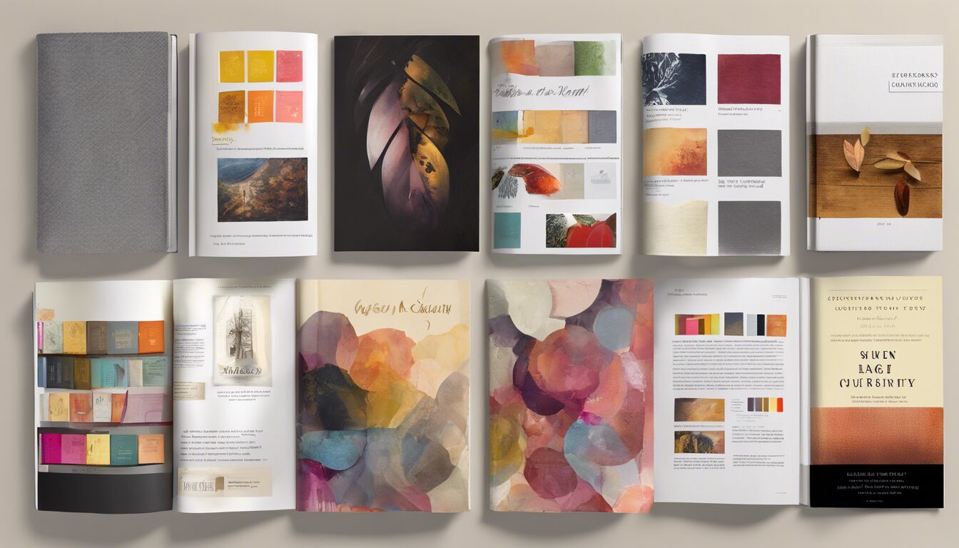
Understanding your audience’s preferences is a crucial first step in creating visuals that sell. Knowing what resonates with your readers allows you to design a book that captures their attention and keeps them engaged. Conducting market research, whether through surveys, focus groups, or studying bestsellers in your genre, can provide valuable insights into what your audience finds appealing. Consider demographic factors such as age, gender, and cultural background, as these can significantly influence visual preferences.
For instance, a younger audience might favor more vibrant and bold design elements, while an older demographic might appreciate classic and understated aesthetics. The goal is to align your book’s design with the tastes of your target readers, thereby enhancing its visual appeal. As the saying goes, “A picture is worth a thousand words,” and this rings especially true when considering how the right visuals can attract and retain reader interest. Understanding these nuances helps in making informed design choices that can significantly boost your book’s marketability.
Crafting compelling cover designs
 Creating a compelling cover design is pivotal in making a strong first impression. The cover is often the first interaction a potential reader has with your book, making it crucial that it sparks interest and invites them to explore further. A well-crafted cover not only enhances the visual appeal but also communicates the essence of the book, setting the tone and providing clues about its content.
Firstly, consider the central theme of your book. Your cover should reflect this theme, whether it’s a gripping thriller, a heartwarming romance, or an insightful self-help guide. The imagery, fonts, and colors you choose should all align with the message and mood of your content. For example, a horror novel might feature dark, moody colors and eerie imagery, while a children’s book would likely use bright, engaging illustrations and playful fonts.
“Don’t judge a book by its cover” is a popular saying, yet in reality, many readers do just that. Therefore, investing time and creativity in crafting a compelling cover is essential.
Moreover, pay attention to typography, as it plays a significant role in the overall design. The title and author’s name should be clearly readable, even when viewed as a thumbnail online. A mix of font styles can add visual interest but should be used carefully to maintain coherence. Avoid over-cluttering the cover; simplicity often has a stronger impact.
Incorporating unique design elements can also make your cover stand out. This might include custom illustrations, intriguing textures, or striking contrasts. However, ensure these elements complement rather than overwhelm the main focal points. A balance between creativity and simplicity often works best.
Finally, consider the market context and trends. Look at successful books in your genre and analyze what makes their covers effective. While it’s important to stand out, understanding and occasionally aligning with genre-specific expectations can work in your favor.
By thoughtfully integrating these elements, you’re more likely to create a visually striking cover that captures attention and entices potential readers to pick up your book.
The art of typography

The art of typography is an essential component of book design, playing a significant role in enhancing the visual appeal of your content. Typography isn’t merely about choosing a font; it’s about creating a harmonious and readable text layout that complements your book’s overall design. The right typography can set the tone, evoke emotions, and guide the reader through the narrative seamlessly.
When selecting fonts, consider the genre and theme of your book. Serif fonts, known for their traditional and formal appearance, are often used in literary works and historical novels. Conversely, sans-serif fonts, with their clean and modern aesthetic, are better suited for contemporary fiction or non-fiction. Script or decorative fonts can be leveraged for titles or chapter headings, adding a touch of elegance or whimsy, but should be used sparingly to avoid overwhelming the reader.
Readability is paramount. Opt for fonts that are easy on the eyes, particularly for the body text. Typically, a font size between 10 to 12 points is recommended for the main text, ensuring that readers can comfortably enjoy the book without straining. Line spacing, or leading, should also be adjusted to enhance clarity and prevent the text from appearing cramped.
The hierarchy of text elements through the use of different font weights and sizes can significantly influence the reader’s experience. For instance, bold fonts for chapter titles and subheadings help in clearly demarcating sections, making it easier for readers to navigate through the book. Italics can be employed for emphasis or to denote internal monologues or foreign terms. However, consistency is key; sticking to a few well-chosen styles prevents the design from appearing chaotic and maintains a professional look.
Alignment and spacing further contribute to the text’s readability and overall aesthetic. Justified text, where both edges of the text align evenly, often gives a neat and organized appearance but can sometimes result in uneven spacing between words. Alternatively, left-aligned text is more common and tends to be easier to follow. The choice depends on the tone and style of your book, as well as personal preference.
Furthermore, consider the interplay between text and white space. Adequate margins and spacing around paragraphs can prevent the page from looking cluttered and allow the reader’s eyes to rest, enhancing the overall visual appeal of your book. Thoughtfully designed typography ensures that your book is not only beautiful but also a pleasure to read.
Color choices that captivate readers
Color plays a pivotal role in eliciting emotional responses and can tremendously impact the visual appeal of a book. When chosen thoughtfully, color schemes can intrigue potential readers at first glance, setting the mood and hinting at the content inside. Understanding the psychology behind colors can be a significant advantage for any book designer.
Firstly, consider the genre of your book while selecting its color palette. Each genre traditionally aligns with specific colors that evoke the desired emotional response from the reader. For example, mystery and thriller novels often use dark colors like blacks and deep blues to perceive a sense of suspense and intrigue. In contrast, romance novels generally employ softer hues such as pinks and pastels to evoke feelings of warmth and affection.
It’s important to understand the cultural connotations of color, as they can vary widely. For example, while white may symbolize purity and innocence in Western cultures, it can signify mourning and loss in some Eastern cultures. Recognizing these variations is crucial, especially if your book targets an international audience.
Additionally, the color scheme should remain consistent with the book’s theme and tone. Consider using a limited palette complemented by accent colors to draw attention to focal points, such as the title or critical imagery. Complementary colors (opposite each other on the color wheel) can create high contrast and visual interest, while analogous colors (next to each other on the color wheel) offer a more harmonious and soothing effect.
Here are some basic color characteristics to keep in mind:
| Color | Impacts | Best Used For |
| Red | Energy, Passion, Urgency | Thrillers, Dramatic Narratives |
| Blue | Calm, Trust, Intelligence | Non-fiction, Business Guides |
| Green | Growth, Harmony, Freshness | Eco-themes, Self-Help |
| Yellow | Happiness, Optimism, Attention | Children’s Books, Memoirs |
| Purple | Luxury, Mystery, Spirituality | Fantasy, Historical Fiction |
Contrast also plays a critical role in capturing attention. High contrast between the text and background color ensures that the main elements are easily read and stand out. For instance, dark text on a light background or vice versa can highly improve readability and make essential elements pop.
Furthermore, integrating color theory into your design process can enhance visual coherence and professionalism. Harmonious color combinations can engage readers and make flipping through the pages a more enjoyable experience. The goal is to use color not just as a decor element but as a narrative tool that draws readers into the world you’ve created.
Moreover, consider the implications of color across various mediums, especially digital platforms. Colors can appear differently on screens compared to print, so always test your designs in multiple formats to ensure consistency. Digital platforms often require more vibrant colors to stand out on backlit screens, so slight adjustments might be necessary.
In summary, by strategically choosing your book’s color scheme, you enhance its visual appeal and emotional impact, making it more likely to attract and retain readers. This thoughtful approach to color selection can differentiate your book in a crowded market, making it a visual delight that resonates with its audience.
Balancing imagery and text
 When it comes to balancing imagery and text in book design, striking the right harmony is key to maintaining visual appeal while ensuring readability. Both elements must complement each other without competing, creating a cohesive and engaging layout that guides the reader’s eye smoothly through the pages.
Start by considering the primary function of each page. The cover and chapter opener should be heavier on visuals to initially captivate the reader. These visuals—whether photographs, illustrations, or abstract designs—should align with the overall theme and mood of the book, enhancing its narrative. However, the body of the text should focus on readability. Here, images can serve as supplementary elements that break up long passages, add context, and provide a visual rest.
One effective approach is to use images that are directly relevant to the content of the accompanying text. This not only enhances understanding but also keeps the reader engaged. For example, in a travel memoir, integrating high-quality photos of the locations described can transport the reader more vividly into the narrative. Conversely, a business book might incorporate graphs or infographics to visually explain data.
White space, or negative space, is another crucial element in balancing imagery and text. Adequate margins and spacing around both text and images prevent clutter, making the pages look clean and organized. This white space guides the reader’s eyes and gives them a visual break, enhancing the overall reading experience.
Alignment and proximity are also significant in creating a balanced layout. Ensuring that text and images are aligned harmoniously helps in maintaining a structured and professional look. For example, wrapping text around an image can create a seamless integration, provided that the text remains readable and the image isn’t overpowering.
Moreover, be mindful of the scale of images versus text. Large, impactful images work well for covers and section openers but may overwhelm if overused in the body text. Conversely, smaller images can serve as cues or decorative elements without stealing the spotlight from the written words. Always aim for a proportionate relationship where one element enhances the other rather than overshadowing it.
The use of color in both imagery and text further plays a vital role. Ensure that the color schemes of your images do not clash with the text color. For instance, if you have a photo with predominantly warm tones, pairing it with a text in complementary cool tones can create a visually pleasing contrast. It’s essential to maintain consistency in your color palette to reinforce the themes and enhance visual appeal.
Interactive elements, particularly in digital formats, can also help balance imagery and text. Hyperlinks, embedded videos, and clickable icons can provide an engaging experience without overwhelming the reader with too much print content at once. These elements can also serve as a bridge, connecting text and imagery in a cohesive manner.
Additionally, varying the layout through the book can maintain reader interest. Not every page needs to follow a strict grid pattern. Introducing full-bleed images, pull quotes, and sidebars can add visual diversity. However, ensure that these elements do not break the flow but rather contribute to a rhythmic pacing.
Consider the context in which your book will be read. A coffee table book, for instance, can afford to be more image-centric with minimal text, while a novel needs a delicate balance to maintain narrative flow. Understanding your target audience’s preferences, as discussed earlier, can guide these decisions effectively.
Incorporating these strategies thoughtfully ensures that your book design retains a harmonious balance between imagery and text. This not only elevates the visual appeal but significantly enhances the reader’s engagement, making your book a compelling read from cover to cover.
Ensuring consistency and cohesiveness

Ensuring consistency and cohesiveness in your book design is essential to creating a professional and appealing final product. This involves maintaining uniformity across various design elements such as fonts, colors, layout, and imagery to provide a seamless reading experience. A consistent design not only enhances the visual appeal of your book but also helps in reinforcing its identity and message.
Start by establishing a style guide before you begin the design process. This guide should include specifics about font choices for headings, subheadings, and body text, as well as the color palette and image styles. Having these elements documented ensures that any designer or collaborator working on your book can adhere to the established design parameters, maintaining coherence throughout the entire project.
One way to ensure consistency is by sticking to a limited number of fonts. Typically, selecting one font for the body text and another for headings is sufficient. The body text should be highly readable, whereas the headings can be more stylized to create visual interest. Avoid using more than three different fonts, as this can make your design look chaotic and unprofessional.
Color consistency is equally vital. Choose a primary color palette that reflects the mood and theme of your book and use it consistently on the cover, chapter headings, and other significant sections. Complementary and accent colors can be used sparingly to highlight important text or visuals. Consistent color usage ties different parts of the book together, providing a unified visual experience for the reader.
Imagery should also follow a consistent style and quality. Whether you are using photographs, illustrations, or infographics, ensure that they have a similar tone and execution. This creates a cohesive feel as the reader moves from one section to another. For example, if you start with vibrant, high-contrast photos, avoid suddenly switching to pastel, low-contrast images, as this can disrupt the visual flow.
Layout consistency plays a significant role in maintaining cohesiveness. Chapters, sections, and pages should follow a uniform layout structure. This includes the placement of text, images, and white space. For instance, if you use a specific grid layout for your chapter openers, stick to that layout throughout the book. Consistent margins and padding also ensure that the design looks neat and well-organized.
Consider the use of recurring design elements like headers, footers, and page numbers. These elements provide not only functional benefits but also stylistic unity. Headers and footers can contain elements like book titles, chapter names, or author names, all styled consistently.
Moreover, visual motifs or themes can tie your content together. For example, if your book is about nature, you might use leaf icons or natural textures as subtle design elements throughout the book. These motifs should be consistently applied to avoid any jarring design interruptions.
Interactive features, especially for eBooks, must also maintain consistency. Hyperlinks, buttons, and other interactive elements should follow a similar design, including color, size, and shape. This uniformity helps readers easily understand and interact with the content without confusion.
Proofreading for design consistency is as important as checking for grammatical errors. Carefully review each page to ensure that fonts, colors, and layouts are applied consistently. This might involve checking for uniformity in text alignment, image placement, and even line spacing.
Additionally, feedback from beta readers or a focus group can be invaluable. They might point out inconsistencies that you have overlooked, allowing you to make necessary adjustments before the final publication.
Maintaining consistency and cohesiveness in book design not only enhances your book’s visual appeal but also ensures a pleasant reading experience. It reflects a high level of professionalism and attention to detail, which can significantly attract and retain readers. When all design elements work harmoniously together, your book becomes a compelling visual and narrative journey that resonates with its audience.

