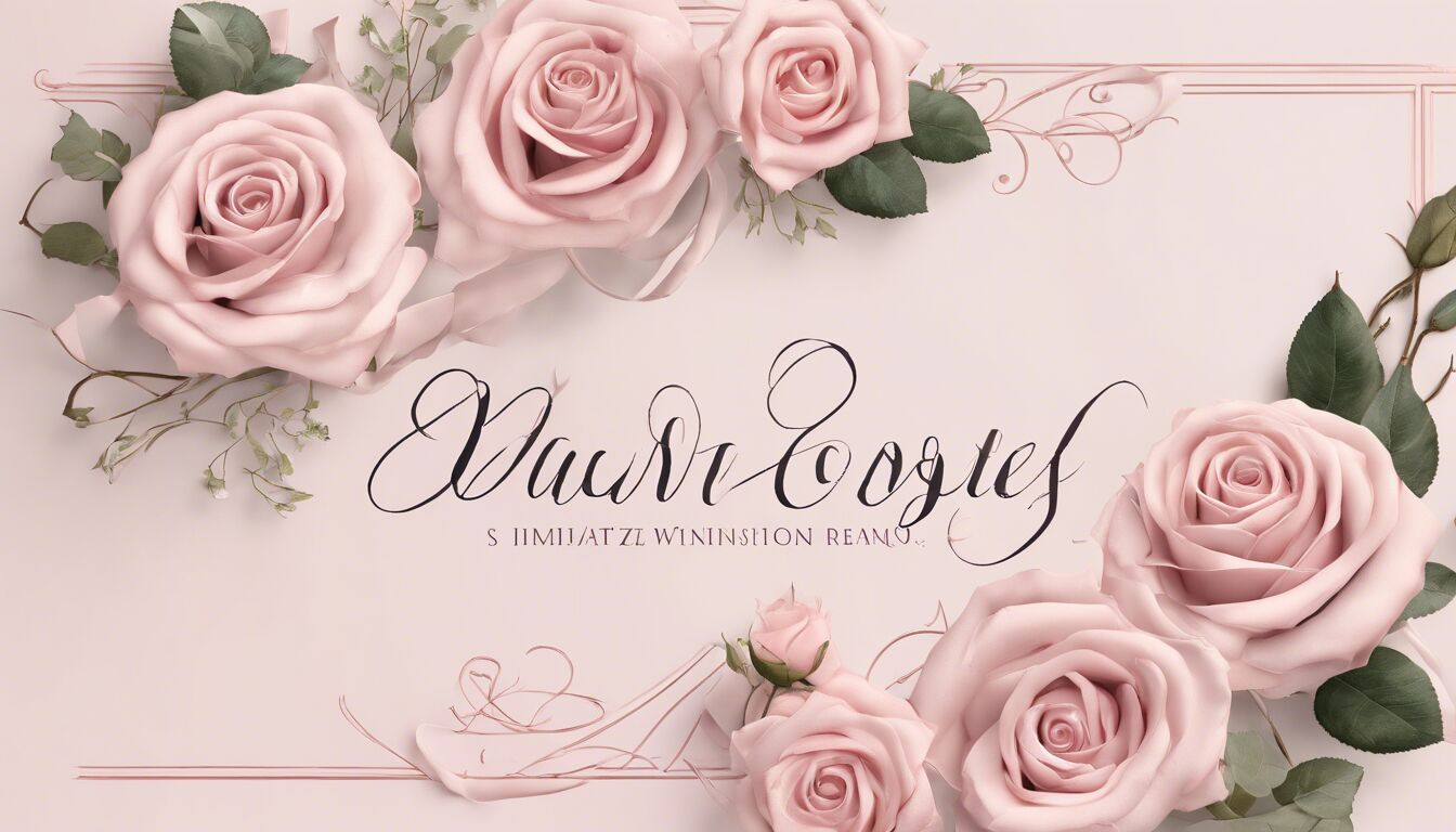
Typeface selection extends beyond aesthetics; it plays a crucial role in evoking emotional responses. When it comes to romantic fonts, the goal is to choose those that communicate feelings of love, tenderness, and warmth. Fonts have their own personalities, and understanding these can help in conveying the right emotion in your design.
Serif fonts, for instance, often evoke a sense of tradition, reliability, and a touch of elegance. Their classic appeal can communicate deep, enduring love. On the other hand, sans-serif fonts are typically seen as modern, clean, and straightforward; selecting the right sans-serif can suggest a fresh, earnest romance.
Script fonts, known for their flowing, cursive nature, easily convey emotions of intimacy and passion. These fonts mimic natural handwriting, which can make them feel more personal and heartfelt. When using script fonts, you effectively scream, “This is handmade with love!” The emotional response they generate is due to their swashes and loops, which add a human touch and can be very expressive.
Font emotions also tie closely with typography trends and cultural representations. For example, vintage fonts may bring nostalgia and a sense of timeless romance, whereas modern fonts create an airy, less complex feeling, perfect for lighter, contemporary love stories. Recognizing these associations helps in selecting a font that matches the emotional tone you’re aiming for.
In addition, consider the words you’re using alongside these fonts. Phrases or single words like “always” or “forever” set in a suitable font can be powerful in invoking strong romantic sentiments. According to typographic research, “The typeface you choose can either enhance or diminish the message you want to convey” – a fitting reminder of why understanding font emotions is so crucial.
The ultimate aim is to create a harmonious balance between the text’s message and its visual representation. Romantic fonts, when chosen with care, can turn a simple sentence into an emotionally resonant declaration of love.
Serif vs sans-serif: making the choice
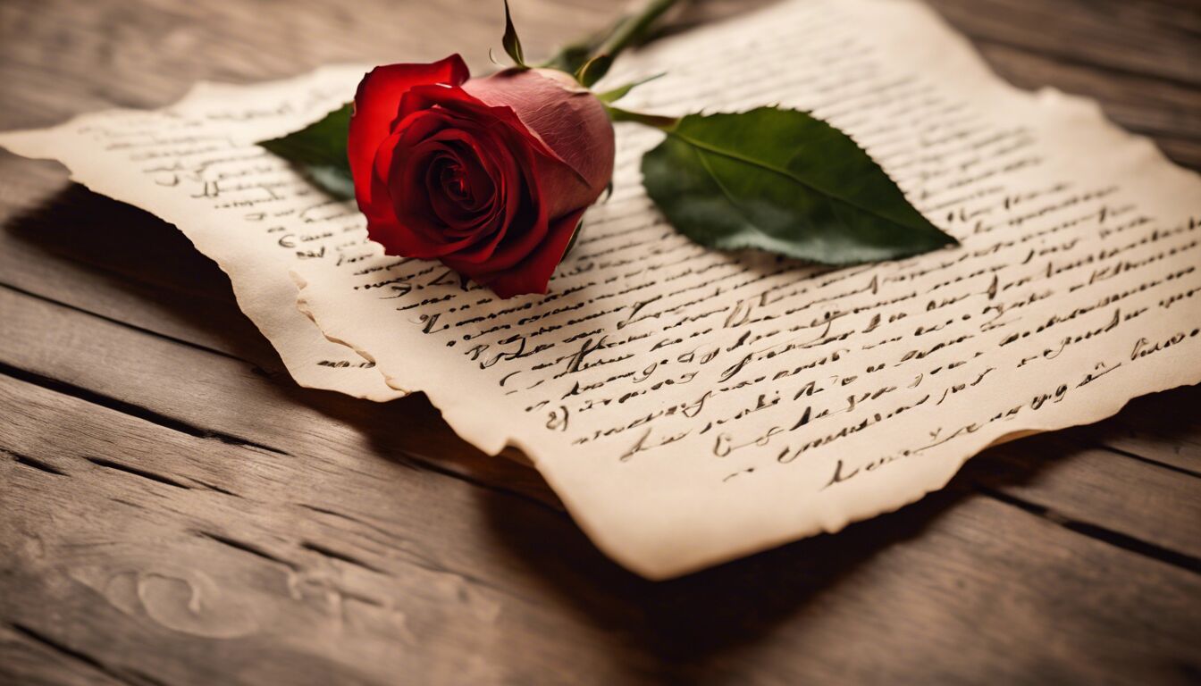 When delving into the selection between serif and sans-serif typefaces, it’s essential to grasp how each category can influence the perception of romantic messages. Serif fonts, with their small lines or strokes regularly attached to the end of a larger stroke in a letter or symbol, exude a sense of formality and tradition. They’re often associated with printed literature and historical texts, therefore carrying an air of enduring love and devotion.
Choosing a serif font for romantic content can evoke timeless charm. Fonts like Garamond and Baskerville are perfect for love letters and classic poetry, as they reflect a traditional elegance and warmth. The subtle details in their serif strokes convey a message of care and attention to detail – qualities often appreciated in romantic expressions.
Contrast this with sans-serif fonts, which lack the small projecting features at the end of strokes. These fonts are perceived as more modern and straightforward. Their clean lines and simple forms add a fresh and uncluttered feel to the text. This can be ideal for newer, contemporary relationships or romantic endeavors aimed at a younger audience. Fonts like Helvetica and Arial are not typically seen as romantic fonts, but when paired with the right colors and design elements, they can effectively communicate a sincere, uncomplicated love.
“Type is a beautiful group of letters, not a group of beautiful letters.” – Matthew Carter
Serif fonts’ complexity and their historical connotations make them suitable for conveying deeper, more profound emotions. Imagine a wedding invitation festooned in a finely crafted serif font – it sets the tone for a traditional, heartfelt ceremony. Conversely, a save-the-date card in a sleek, sans-serif font can suggest a modern, trendy celebration.
While serif fonts might be utilized to capture the essence of enduring affection, sans-serif fonts bring an element of honesty and clarity, free from decoration, which can also be appealing. This juxtaposition shows that the choice between serif and sans-serif largely depends on the nature of the romance you wish to project – whether it’s tender and historical, or fresh and straightforward.
Ultimately, both types of fonts can be used effectively in romantic contexts, provided they align with the message’s emotional depth and the intended audience. While serif fonts may naturally evoke sentimentality, sans-serif fonts can provide a contemporary touch, making both indispensable in the toolkit of romantic typography.
Script fonts for love letters
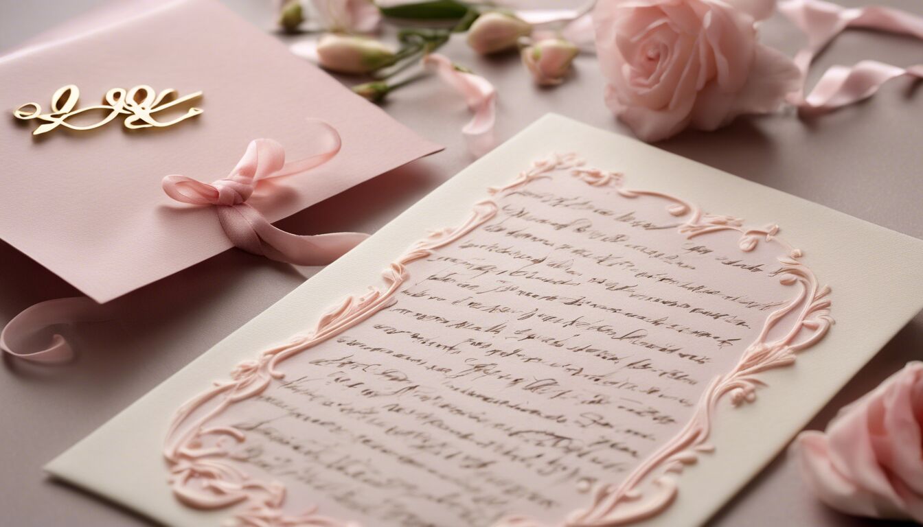
Script fonts stand out distinctly when it comes to conveying romance, primarily due to their flowing, cursive style that mimics the nuances of natural handwriting. This inherent characteristic makes script fonts ideally suited for romantic contexts, as they can deliver a deeply personal and intimate feel. The aesthetic appeal of these fonts lies in their decorative swashes, flourishes, and loops that add a sense of whimsy and emotion to any text.
Fonts like Edwardian Script, Lobster, and Bickham Script are popular choices for love letters, wedding invitations, and romantic cards. These script fonts exude elegance and sophistication, embodying the essence of romantic fonts. Their intricate letterforms create a visual poetry that aligns perfectly with phrases of love and affection, transforming simple words into heartfelt declarations.
The beauty of script fonts is in their ability to convey warmth and sentimentality without the need for embellishments. When employed in romantic texts, the handwritten look evokes a sense of nostalgia and genuine emotion. Imagine receiving a love letter penned in a script font – the immediate association is one of careful thought and deep feeling, reminiscent of Victorian-era letters sealed with a kiss.
Moreover, script fonts offer a versatile range of styles, from casual and playful to formal and traditional. This versatility enables designers to pick a font that closely matches the tone and mood of their romantic message. For instance, a playful script like Pacifico may be perfect for a light-hearted, fun love note, while a more formal script such as Great Vibes would suit a solemn wedding vow or an anniversary card.
However, the use of script fonts requires careful consideration to maintain legibility and avoid being overwhelming. Due to their ornate nature, script fonts should be used sparingly and ideally for short phrases or headings. Overuse can lead to a cluttered design and detract from the romantic message you aim to convey. Pairing script fonts with simpler typefaces can balance the aesthetic, ensuring that the design remains clear and readable while still capturing the desired emotion.
When combined thoughtfully with other elements, script fonts can produce stunning visual contrasts. For example, combining a delicate script font with a clean sans-serif typeface can highlight the romantic message and create an elegant, modern look. This pairing allows the script font to stand out and add a decorative touch without overpowering the overall design.
Incorporating script fonts into designs requires a nuanced approach. It’s essential to ensure that the chosen font reflects not just the aesthetic preferences but also the emotional tone of your message. Whether it’s for a heartfelt wedding invitation or a spontaneous love note, selecting the right script font can make all the difference in conveying your true feelings.
Combining fonts for romantic appeal
Combining different typefaces can create a unique, multifaceted expression of romance that a single font alone may not achieve. The strategic pairing of fonts adds depth and dimension to your typographic design, making the romantic message more dynamic and engaging.
When combining fonts, it’s essential to ensure they complement each other rather than compete for attention. A well-executed pairing maintains a balance, where one font can serve as the primary communicator while the other enhances and supports it.
A common approach involves selecting a dominant typeface that captures the main emotional tone and partnering it with a simpler, more neutral secondary typeface. For instance, you might pair a script font like Bickham Script with a clean sans-serif like Avenir. The script font can be used for the main message or headings, channeling intimacy and elegance, while the sans-serif provides clarity and readability in smaller, supporting text.
| Primary Font | Secondary Font | Emotion |
| Bickham Script | Avenir | Intimacy & Clarity |
| Garamond | Helvetica | Elegance & Modernity |
| Lobster | Montserrat | Playfulness & Simplicity |
Another effective strategy involves combining a serif font with a sans-serif. For example, pairing Garamond with Helvetica can evoke both timeless elegance and modern simplicity. This combination is ideal for creating a romantic yet contemporary appeal suitable for wedding invitations or love letters that blend tradition with a fresh touch.
To further enhance the romantic appeal, consider the mood you wish to convey. A playful and whimsical vibe might be achieved by combining a bold, handwritten script like Lobster with a rounded sans-serif such as Montserrat. This pairing brings a sense of joy and informality, perfect for light-hearted romantic messages or casual love notes.
Combining fonts also allows you to highlight specific elements of your text. Use a script or serif font to emphasize important words or phrases, while a simpler sans-serif maintains overall readability. For example, in a love letter, writing “I love you” in Edwardian Script with the rest of the letter in Arial creates a beautiful focus on the declaration of love, accentuating its importance.
It’s crucial to ensure that the fonts’ weights and styles are harmonious. Avoid pairing fonts with extremely contrasting weights, as this can make the text visually jarring. Instead, aim for a balance, where the typefaces have enough contrast to differentiate but still work together cohesively.
Incorporating color can further accentuate the romantic themes. Soft, pastel colors paired with elegant fonts enhance the romantic nuance, while strong, vibrant hues combined with clean, modern fonts can add a contemporary twist.
Finally, test your font combinations extensively. Ensure that the text remains legible and the overall design is aesthetically pleasing. By experimenting with various pairings and seeking feedback, you can find the perfect combination that captures the romantic essence you intend to convey.
Thoughtful font combinations can transform an ordinary piece of text into a poetic and emotionally resonant statement. Whether it’s a wedding invitation, a Valentine’s Day card, or a romantic novel cover, the right mix of typefaces ensures your romantic fonts speak as loudly as your words.
Color and font psychology
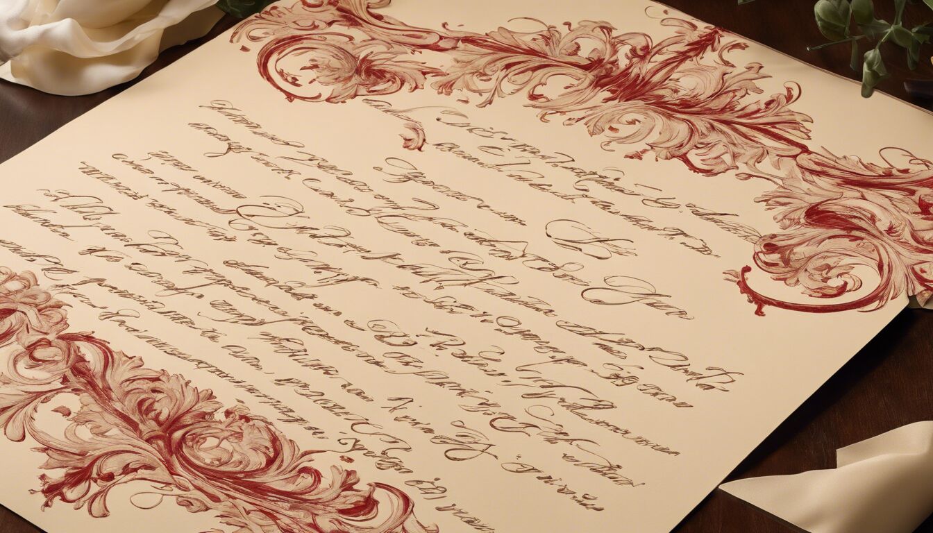 Color selection plays a pivotal role in the psychology of romantic fonts. Just as specific typefaces can evoke emotions, so too can colors enhance or alter the perception of the text they accompany. The combination of the right font with thoughtfully chosen colors can amplify romantic feelings, creating a powerful and memorable emotional impact.
Red is commonly associated with passion and intensity. When paired with a flowing script font, this color can convey deep feelings of love and desire. Think of a love letter written in deep red Edwardian Script — the visual cues alone would immediately signal affection and ardor. However, using too much red can sometimes appear aggressive or overwhelming, so balance is crucial.
Pink, on the other hand, is softer and more delicate, frequently linked to gentle, romantic sentiments. A light pink palette alongside a romantic font like Bickham Script can communicate tenderness and sweetness. It’s particularly effective for wedding invitations and Valentine’s Day cards, where a soft, romantic tone is desired. Pink works well with both serif and sans-serif fonts, adding a touch of warmth and kindness to any design.
Purple, often connected to mystery and luxury, can add a sense of depth and sophistication to romantic communications. Pairing a deep lavender color with an elegant serif font like Garamond can evoke a rich, enduring love. This combination can be particularly effective for anniversary cards or any occasion where you wish to express a profound, deep-rooted affection.
In addition to the traditional romantic hues, don’t overlook the power of neutral tones like white, ivory, and cream. These colors provide a clean, pure background that can make romantic fonts stand out, lending an airy and timeless feel. Perfect for wedding stationery, an ivory background with delicate script fonts in gold or silver can create a sense of elegance and understated romance.
Moreover, color harmony is essential when combining fonts. For a balanced and cohesive look, ensure that the colors complement each other. For example, a rich burgundy script paired with a neutral beige serif can create a refined, romantic appeal without clashing. Conversely, combining clashing colors or overly bright tones can detract from the romantic message you intend to convey, making the design feel chaotic or insincere.
It’s also important to consider the cultural implications of color. Different cultures may associate various meanings with colors, which could influence how your romantic fonts are perceived. In Western cultures, white is often associated with purity and weddings, whereas in some Eastern cultures, white can symbolize mourning. Such cultural nuances should guide your color selection to ensure the right emotional response is evoked.
Another aspect to bear in mind is the psychological effect of color intensity and saturation. Bright and saturated colors like bold reds or vibrant pinks tend to attract attention and evoke stronger emotions. In contrast, pastel colors or muted tones can convey subtler feelings, bringing a sense of calm and sophistication to the design. Choosing the appropriate level of intensity can greatly affect how your romantic fonts are perceived and can sway the overall atmosphere of your message from passionate to serene.
Lastly, consider the context and medium in which your design will be showcased. Digital screens and print media can portray colors differently due to variations in lighting and material. Conducting thorough tests can ensure that the chosen color and font combination maintains its intended emotional impact across various platforms.
Color and font psychology, when combined thoughtfully, can elevate typographic design, turning simple text into a profound emotional experience. By understanding the interplay between font styles and color choices, you can make deliberate decisions that enhance the romantic essence of your message, making it truly resonate with your audience.
Real-world examples of romantic fonts
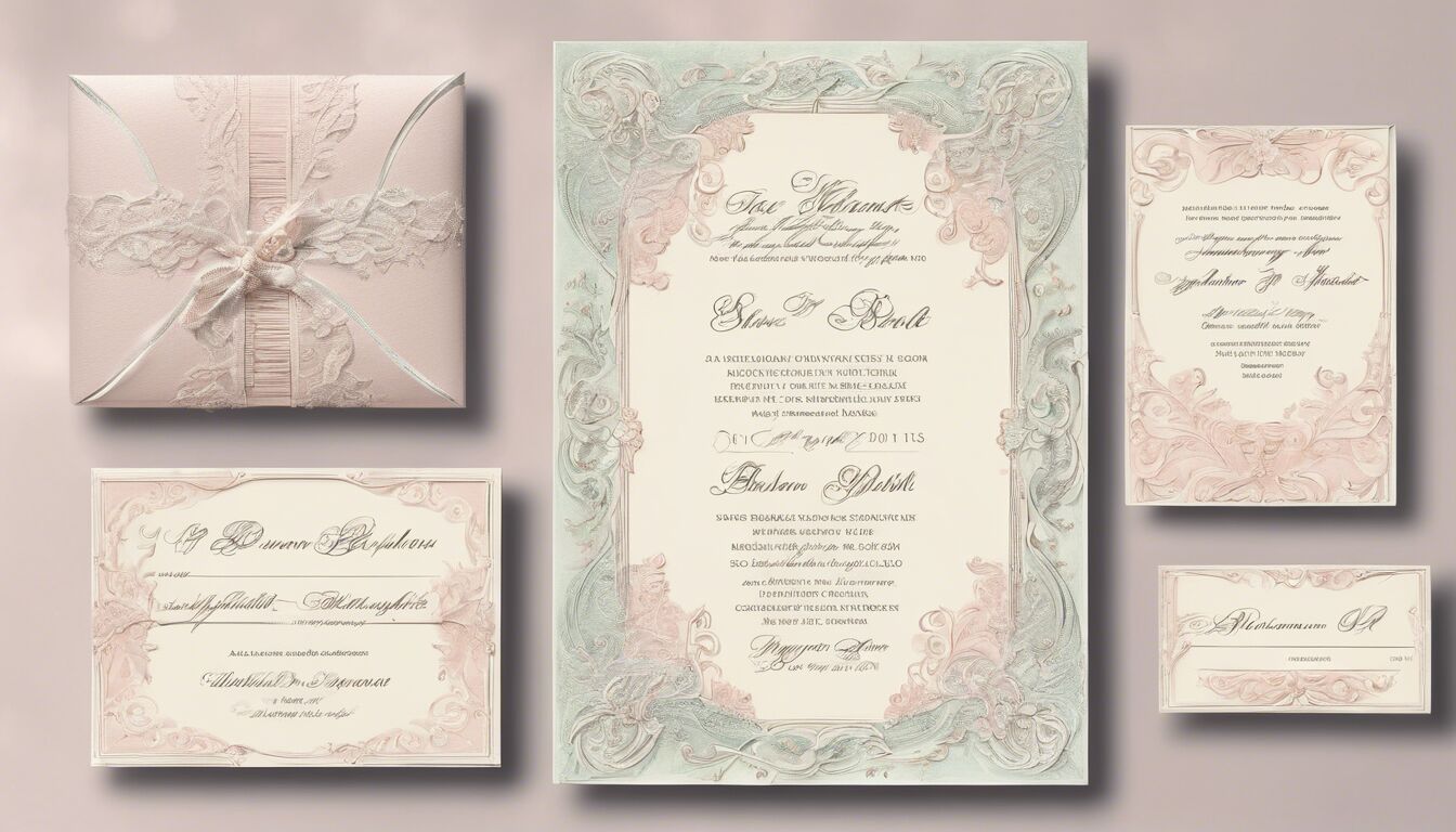
In various creative projects, real-world examples of romantic fonts demonstrate how typeface selection can profoundly shape the emotional tone. Wedding invitations, for instance, often highlight the power of romantic fonts to evoke feelings of love and commitment. A classic choice for such occasions is the Bickham Script, known for its intricate, flourishing strokes, which add elegance and grace to any nuptial communication. Paired with subtle pastel colors, this font can transform a simple invitation into a work of art brimming with emotional undertones.
Another exemplary use of romantic fonts is seen in love letters and personal notes. Handwritten-looking fonts like Dear John or Allura inject an element of sincerity and intimacy. These fonts emulate the style of handwritten text, making the message feel personal and heartfelt. This approach is often used for Valentine’s Day cards, anniversary notes, or any situation where capturing the authenticity of one’s feelings in written form is paramount.
In the realm of branding, companies that market romantic products or experiences often utilize fonts that convey tenderness and allure. Perfume brands, for instance, might use delicate serifs or elegant scripts to reflect the sophistication and sensuality of their fragrances. Packaging for products like Chanel No. 5 often features sophisticated, flowing cursive fonts that communicate luxury and romance, aligning perfectly with the brand’s identity.
Book covers, particularly for romance novels, provide another rich source of real-world examples. Fonts on these covers must appeal directly to the reader’s emotions, hinting at the passion and drama within the pages. Titles set in ornate scripts like Edwardian Script or Great Vibes immediately signal to the potential reader that the book’s content will be filled with intimate and romantic moments. The softness of the curves and the fluidity of the lines in these fonts set the tone even before the first page is turned.
Advertising campaigns for romantic getaways or honeymoon packages also leverage the power of romantic fonts to entice potential clients. Fonts such as Lavanderia, with its relaxed yet refined strokes, or Alex Brush with its approachable elegance, can imbue advertisements with a sense of allure and exclusivity. These typefaces can make phrases like “Escape to Paradise” or “Unforgettable Honeymoon” more inviting and emotionally resonant, thereby appealing directly to the desires and dreams of a romantic audience.
Greeting card companies often turn to fonts like Satisfy or Pinyon Script to craft cards that express love and affection. These fonts, with their romantic flair and elegant lines, allow simple messages like “I love you” or “Thinking of you” to be imbued with more profound emotional weight. The right font can make these messages more impactful, enhancing the likelihood that they will touch the recipient’s heart.
Fashion brands, particularly those focusing on evening wear or bridal collections, frequently utilize romantic fonts in their marketing materials to convey luxury and romance. For instance, the use of Cinzel Decorative in promotional materials can evoke a sense of classic sophistication and timeless beauty, perfectly aligning with the luxurious appeal of elegant gowns and bridal attire. Similarly, brand logos for high-end romantic apparel often feature these types of fonts to communicate an air of exclusivity and refinement.
Digital media platforms, including websites and social media, also provide a plethora of examples where romantic fonts are effectively applied. Blogs or websites dedicated to love stories, wedding planning, or romantic advice often employ fonts like Love Light or Butterfly Kids to create an inviting and warm atmosphere. These fonts, when used in headers or key quotes, draw readers in and enhance the site’s emotional impact.
Each of these real-world examples highlights the versatility and effectiveness of romantic fonts in various contexts. The careful selection of typefaces that convey love, intimacy, and elegance can transform ordinary text into compelling, emotive content that resonates deeply with the audience. Whether in print or digital format, the right romantic font can make a lasting impression, forging a stronger emotional connection between the message and its recipient.

